I think the problem with having illustrator is that I can play around with colors - over, and over, and over again. You might notice I changed up the look a bit now, and I wanted to see what you think?
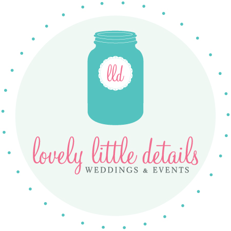
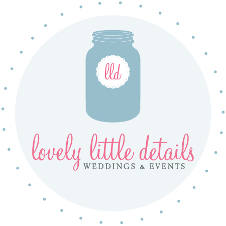
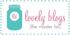
Here’s the original:
and here’s an updated color scheme:
Of course I could play around with it all day, so I wanted to see what you all think? More teal/less blue, maybe more green? Just stop while I’m at it and leave as-is?
Thanks :)
Happy Saturday!












{ 36 comments… read them below or add one }
I like the original best
I love the first/original :-)
This is tough! I like them both. I may be biased towards the new though. because it's closer to colors I usually like.
The first one! Love the teal.
I like the first one. Maybe I'm biased because those are part of my wedding scheme ; ) I love neutral colors, but I think the first really pops.
I like the muted blue better. It allows the pink to stand out more. Whereas I think the teal competes with the pink. P.S. I adore your business name:)
Just my humble opinion- the first is best! The first is more original whereas the second is a shade of blue that many in the bridal business use. But either one looks nice :-)
I like the original best :)
Hi Jacin! Obviously both are elegant. My preference is the first one. Since the color is brighter, it seems as if there's more "energy" in it. Plus, the teal and pink are closer to the complimentary red/green relationship on the color wheel. But, it's about what feels right for YOU and YOUR brand. xoxo, MademoiselleMichael
P.S. With our names, we were basically born to be friends :)
I think I have to go against the grain and say I love the second one. OOOPS. But I love cornflower blue. I can't help it.
Ramblings of a Small Town Girl
Love the watermelon/cadet blue.
I like the teal much better. The second one basically uses two saturations of the same colour/shade (I don't know the technical terms!), which is of course lovely, but mixing the teal in just makes it so much more interesting.
original for sure :)
love them both but the original is my favorite!
I generally like blue better and would tend to go to the second one but in a way, the first one has more pop… so I kind of think the first one is better :)
Hmm… i REALLY like the second one! :) but both are great!
yes im from jersey btw! my fiance's from hoboken, i'm from palisades park! u lived in jersey??
That is a hard choice, but the blue sticks out to me more. It just feels softer and elegant. :)
i love the newer one. it's more soothing and matches the scheme better :)
They're both nice but I still like the first once best!
love the teal and pink color palette! original one is my favorite.
Both of them are awesome! But I really love the first one!!
So hard to chose, and I'm sure everyone's dissenting opinions aren't helping! When I saw just the two logos, I liked the first better, but I think the more demure blue works better for all the other places you use it on the blog and the page!
Original! It really pops!
The original!
I love the first one because I just LOVE turquoise! However.. I do love the the blue/grey and pink theme you have going on right now. So ultimately, I pick number two :)
i love the original… but i might just be sentimental about it… but both are fab, so go with your gut!
i love the original… but i might just be sentimental about it… but both are fab, so go with your gut!
i love the original… but i might just be sentimental about it… but both are fab, so go with your gut!
i love the original… but i might just be sentimental about it… but both are fab, so go with your gut!
i love the original… but i might just be sentimental about it… but both are fab, so go with your gut!
Love the original one with the bright turquoise!
I really love the first one. It pops and makes you stand out in a saturated field. Also, the faded blue is incredibly hard to read as a font color. Finally, I feel like the fun, cheerful teal matches your fun, cheerful personality so much more! So fresh!
Eek! You sound like me ;-))) However, I love the pop from the first (original) one and am going to vote for that one! But you have do to what feels right for you. I think we all loved the first one because it was new, but had the blue one came out first…we'd all probably be loving that one! See, no help at all really ~ sorry!
xoxo
kristi
Isn't it sweet how everyone gave their 2 cents' worth about your logo? Are you now going to surprise us all and go with something totally different? lol
THANKS EVERYONE!!! teal it is :)
I'm a fan of the teal… but my wedding colors were teal and my bedroom is teal… I think I like teal :)